


Best 74
Charting
Products
0 PH launches analyzed!

Graphy Lite
The best way to create & share charts on the internet
990

Problem
Users struggle with creating visually appealing and interactive charts, which results in less engaging and informative visual data representations. Creating visually appealing and interactive charts is often time-consuming and requires specific design or technical skills.
Solution
Graphy Lite is a web-based tool that enables users to easily create stunning and interactive charts. Users can add their data, customize the chart's appearance, and share or embed them online.
Customers
Data analysts, marketers, educators, and bloggers who need to present data in a visually appealing way to support their storytelling, analysis, or reporting.
Alternatives
View all Graphy Lite alternatives →
Unique Features
Graphy Lite's unique features include its simplicity and the quick three-step process: add data, customize, and share. The ability to create interactive charts easily sets it apart.
User Comments
Users find Graphy Lite extremely user-friendly.
They appreciate the ease of creating professional-looking charts.
Many highlighted its effectiveness in making data presentations more engaging.
Some mentioned the quick learning curve as a significant advantage.
Several users were pleased with the sharing and embedding features.
Traction
Unable to find specific quantitative data on Graphy Lite's traction. Information such as number of users, MRR, or financing details were not available on Product Hunt or the product's website as of the knowledge cutoff in April 2023.
Market Size
Unavailable specific market size data for Graphy Lite. However, the global data visualization market is expected to grow from $8.85 billion in 2019 to $19.20 billion by 2027.

Problem
Users struggle to effectively turn their data into understandable narratives and insights.
Drawbacks: Lack of tools to easily create data visualizations and communicate key insights leads to time-consuming manual processes and potential misinterpretation of data.
Solution
Dashboard tool that transforms data into compelling stories and visuals with AI assistance.
Core features: Automatically generate charts, graphs, and key insights from user-entered data, ready for presentations or sharing on collaboration platforms like Slack.
Customers
Data analysts
Specific Position: Data scientists, business intelligence professionals, marketers, and educators.
Unique Features
AI-powered data interpretation and visualization for easy storytelling.
Seamless integration with presentation tools and communication platforms.
User Comments
Easy to use, saves a lot of time in creating reports.
The generated visuals are clear and insightful.
Great for sharing data findings with team members.
Helps in making data-driven decisions effectively.
Useful tool for non-technical users to work with data.
Traction
Over 10,000 users signed up within the first month of launch.
Featured on ProductHunt with 500+ upvotes.
Growing MRR of $50k with a user retention rate of 80%.
Market Size
$13.8 billion was the global data visualization market size in 2021, with a projected CAGR of 9.2% from 2022 to 2028.
Increasing demand for data-driven decision-making across industries is driving the growth of the market.
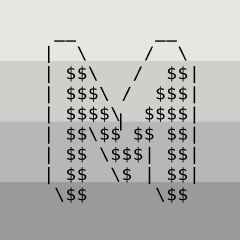
MRRArt Pro
Create beautiful text charts (ascii) from your data
565
Problem
Creating visually appealing and informative data charts for social media platforms can be time-consuming and requires graphic design skills. This makes it difficult for users to quickly share data-driven insights in an engaging format, leading to less audience interaction and potential lost opportunities for visibility.
Solution
MRRArt is a tool that allows users to create beautiful text (ascii) charts from their data. It offers customization options such as width, height, gap, or labels, enabling users to tailor their charts for various social media platforms like Twitter and LinkedIn. This turns a potentially hours-long task into a matter of seconds.
Customers
Data analysts, marketers, social media managers, and anyone looking to share data insights on social media platforms to increase engagement and visibility.
Unique Features
What sets MRRArt apart is its focus on generating ascii text charts, which are highly customizable yet simple to create. This approach allows for a novel and engaging way to present data that stands out on social media feeds.
User Comments
Couldn't find user comments due to lack of access to specific feedback on MRRArt's ProductHunt page or other platforms.
Traction
Couldn't find specific traction metrics such as number of users, MRR, or financing details due to lack of access to detailed information on MRRArt's current status.
Market Size
The global data visualization market size is expected to reach $10.2 billion by 2026, growing at a CAGR of 10.2% from 2021 to 2026, indicating a substantial market opportunity for MRRArt.

InstaCharts
Create charts from your data instantly
187
Problem
Users struggle to visualize data from spreadsheets or Google Sheets files efficiently and quickly
Manually converting data into charts and graphs is time-consuming and requires technical skills
Solution
An online chart maker tool
Users can instantly convert spreadsheet or Google Sheets files into charts and graphs, and then export, share, or embed them on webpages
Create charts from data instantly
Customers
Data analysts
Marketers
Startup owners
Individuals or professionals needing quick and easy data visualization
Unique Features
Instant conversion of data to charts
No-code chart making tool
Easy export, share, and embed options
Efficient and quick data visualization without technical skills
User Comments
Easy-to-use tool for creating charts quickly
Saves time and effort in data visualization tasks
Great for sharing and embedding charts in reports and presentations
Intuitive interface and smooth user experience
Useful for both beginners and advanced users
Traction
Over 10,000 active users
Growth rate of 20% month-over-month
Featured on top tech publications like TechCrunch and Mashable
Market Size
The global data visualization market size was valued at $4.51 billion in 2020 and is projected to reach $7.76 billion by 2026

Problem
Traditional data presentation tools often result in static, less engaging charts. Users struggle to tell compelling data stories that capture and retain audience attention.
Solution
Vizzu is a cinematic data visualization tool that allows users to transform data into animated, engaging chart presentations. Users can create immersive data narratives with clean aesthetics.
Customers
Business analysts, marketers, researchers, and educators who need to present data dynamically. Business analysts and marketers are particularly targeted due to their frequent reliance on data storytelling in presentations.
Alternatives
View all Vizzu alternatives →
Unique Features
The unique feature is its ability to animate data presentations seamlessly, providing a cinematic experience that is both captivating and informative.
User Comments
Transforms dry data into engaging stories.
Highly intuitive and user-friendly interface.
Effective in making memorable presentations.
Ideal for professional and educational settings.
Supports a variety of chart types.
Traction
Launched on ProductHunt with positive reviews, growing user base, and ongoing updates to include more features.
Market Size
The global data visualization market size is projected to reach $19 billion by 2027, growing at a CAGR of 9.69%.

ChartGen AI
Create any chart instantly with just one sentence
146
Problem
Users struggle with creating complex charts and graphs for data visualization due to limited technical skills or tools, leading to time-consuming processes and often less impactful data presentation. The difficulty in easily creating complex yet visually appealing charts and graphs is a significant drawback.
Solution
ChartGen AI is a dashboard tool that enables users to instantly create a wide variety of charts with just a simple sentence. By uploading a dataset and writing a prompt, users can generate beautifully formatted charts and graphs, such as scatter plots, histograms, and box plots, without needing extensive technical skills.
Customers
Data scientists, business analysts, students, and anyone needing to visualize data for presentations or reports. The user personas are thus quite varied, encompassing anyone from the corporate sector, academia, or even casual users looking to present data in a more digestible format.
Alternatives
View all ChartGen AI alternatives →
Unique Features
The ability to generate a wide range of chart types from simple text prompts and uploaded datasets distinguishes ChartGen AI. This feature simplifies data visualization, making it accessible to users with varying degrees of technical expertise.
User Comments
Users find ChartGen AI to be a time-saver for data visualization tasks.
The simplicity and intuitiveness of the platform are highly praised.
Some users were impressed by the quality and variety of charts it can produce.
A few users mentioned a learning curve in crafting effective prompts.
Overall, the feedback highlights the usefulness and innovativeness of ChartGen AI in making data more accessible.
Traction
Since specific traction data such as number of users, MRR, or recent feature launches were not available, and additional information from Product Hunt or the product website did not provide quantitative data, a precise traction summary cannot be provided without assumptions.
Market Size
Due to the lack of specific data on the market size for AI-driven chart and graph creation tools, a comparable industry statistic is the global data visualization market, which is expected to reach $19.20 billion by 2027.

Notion Charts
Create beautiful charts for your Notion pages
139
Problem
Users struggle to integrate visually appealing and functional charts within their Notion pages. Traditional methods can be cumbersome, lacking in aesthetic value, and don't always allow for easy synchronization with a Notion database's data, leading to a disjointed experience and extra manual work in data management.
Solution
Notion Charts is a tool that enables users to create stunning charts directly in their Notion projects. Users can choose from a variety of chart types to suit their data visualization needs. Some tools within Notion Charts also allow for direct synchronization with a Notion database, ensuring that charts are always up-to-date with the latest data.
Customers
Data analysts, project managers, content creators, and educational users who use Notion for project management, data visualization, content organization, and educational material creation.
Alternatives
View all Notion Charts alternatives →
Unique Features
The ability to create visually appealing charts directly within Notion pages and the option for some tools to synchronize directly with Notion databases for up-to-date data visualizations.
User Comments
Users appreciate the ease of creating beautiful charts within Notion.
The synchronization feature with Notion databases is highly valued.
Some users wish for more types of charts and customization options.
The ability to integrate charts has streamlined many users' workflows.
Overall positive feedback regarding the tool's functionality and aesthetic qualities.
Traction
Although specific traction data such as number of users or revenue is not available, the positive feedback and user comments suggest growing interest and adoption among Notion users.
Market Size
Data not specifically available for Notion chart tools, but the global business intelligence and analytics software market, which includes data visualization tools, is projected to reach $17.6 billion by 2024.

Problem
Users frequently deal with repetitive and time-consuming tasks related to data analysis and visualization, which can significantly slow down their ability to produce results and insights effectively.
Solution
ChartFast is an AI data analyst tool that allows users to automate data visualization and analysis tasks, enabling the generation of precise and sleek graphs in seconds, thus saving time and increasing productivity.
Customers
Data scientists, business analysts, and corporate decision-makers who require quick and efficient data analysis and reporting.
Alternatives
View all ChartFast alternatives →
Unique Features
Automates data workflows, generates graphs instantly, and offers user-friendly interface for non-technical users.
User Comments
Simplifies data analysis
Quick generation of reports
User-friendly interface
Highly accurate graphs
Significantly reduces workload
Traction
Newly launched on ProductHunt, growing user interest, specifics about users or revenue not disclosed.
Market Size
The global data visualization market is projected to reach $19.20 billion by 2027.

Chart Builder by TextQuery
Free online tool to create beautiful charts
120
Problem
Users struggle with creating visually appealing charts due to complex software requirements, mandatory account setups, and issues with watermarks on final outputs, which limits their ability to freely use these charts in various professional contexts.
Solution
A free online tool that simplifies the process of creating beautiful charts. Users can just paste some data to create charts without the need for logging in, dealing with watermarks, or purchasing licenses, facilitating the easy use of these charts anywhere.
Customers
Data analysts, marketers, educators, and business professionals who require quick and efficient chart generation for presentations, reports, and educational content.
Unique Features
The tool's unique proposition includes its ease of use, no requirement for account creation, absence of watermarks on outputs, and free licensing for chart usage anywhere.
User Comments
Highly intuitive and saves time
No more dealing with complex software
Finally, a tool without annoying watermarks
Perfect for quick data visualization tasks
Licensing freedom is a game-changer
Traction
No specific traction data available from provided resources or the product's website; information on user numbers, revenue, or other metrics is not mentioned.
Market Size
The global data visualization market size was valued at $8.85 billion in 2019 and is expected to grow.

Make a Chart
Instant charts on Slack
119
Problem
Users need to create charts quickly in Slack
No third-party services or websites make the chart creation process cumbersome and time-consuming
Solution
A Slack app for instant chart creation
Users can input data directly into the app, choose a chart type, and instantly generate charts within Slack
Customers
Teams and individuals using Slack for data visualization tasks
Data analysts, project managers, and collaborators within organizations
Unique Features
Instant chart creation within Slack
Elimination of third-party tools for chart generation
User Comments
Quick and efficient chart creation tool
Saves time and enhances productivity within Slack workflows
Intuitive and user-friendly interface
Eliminates the need to switch between multiple applications for chart creation
Great integration for data-driven discussions on Slack
Traction
Growing user base leveraging Slack integration
Positive reviews highlighting ease of use and time-saving benefits
Market Size
Global data visualization market was valued at $4.5 billion in 2020 and is expected to reach $7.76 billion by 2026.