What is CSS Container Query Converter Tool ?
Built this when my components broke in different spots. Turns media queries to container queries so CSS works by container size, not screen width. Site runs faster too
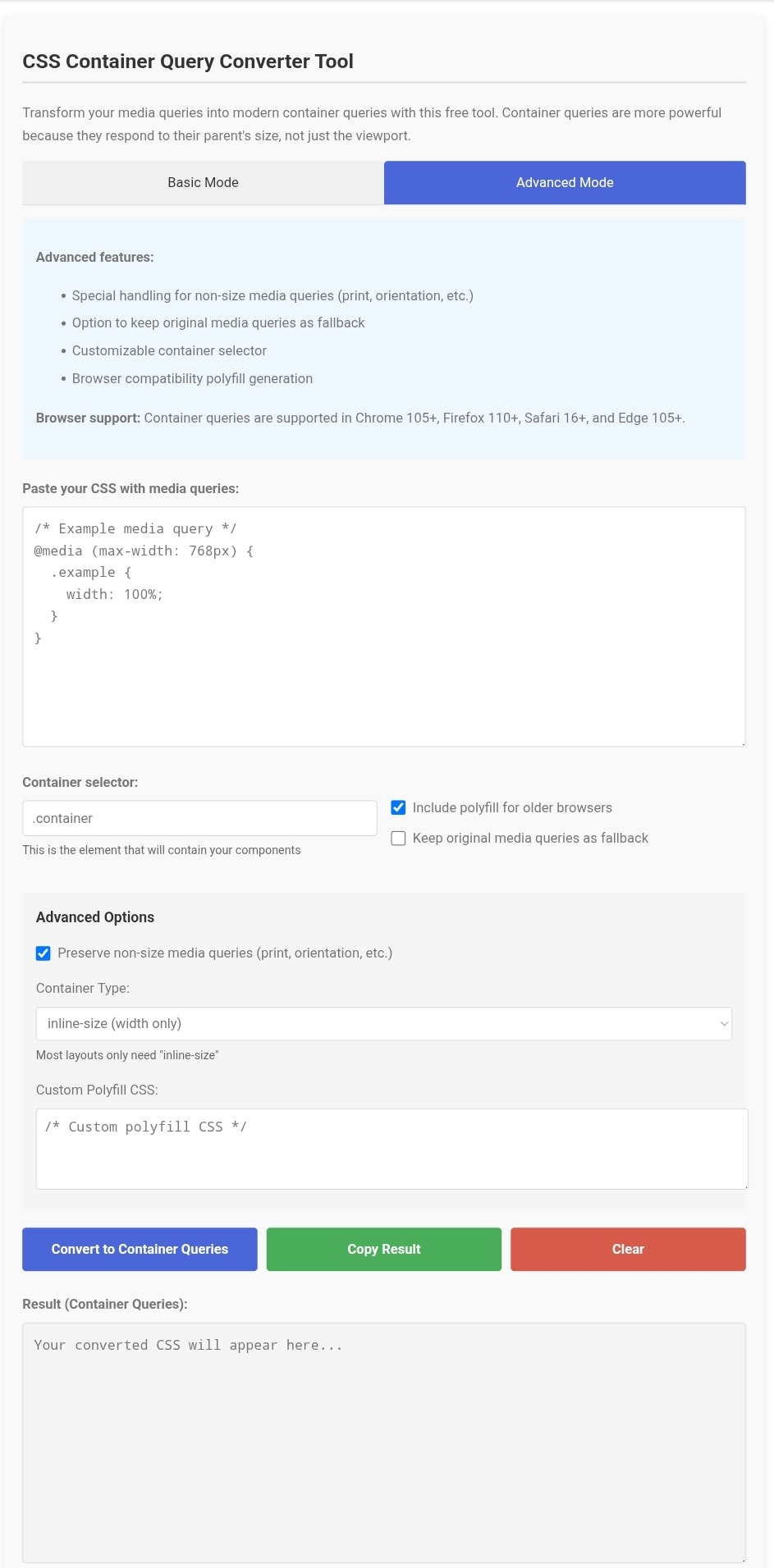
Problem
Users rely on media queries for responsive design, which ties CSS to screen width rather than individual container sizes. Components break when reused in different container sizes, leading to layout inconsistencies and manual adjustments.
Solution
A web-based tool that automatically converts CSS media queries into container queries, allowing developers to write CSS that adapts to container dimensions instead of screen width. Example: Paste media query code to generate container query equivalents.
Customers
Front-end developers, UI engineers, and web designers working on reusable components across varying layouts.
Unique Features
First automated solution for converting media queries to container queries, eliminating manual refactoring while improving site performance via container-based logic.
Traction
Launched 3 days ago (as of analysis date), 180+ upvotes on ProductHunt, featured in CSS-Tricks newsletter.
Market Size
The global front-end development software market is valued at $105.8 billion in 2024 (Statista), with container queries being a key emerging standard.